ADORN
Typography & Printing
Typographic Splendor: Victorian Letterforms and the Presses That Shaped Them
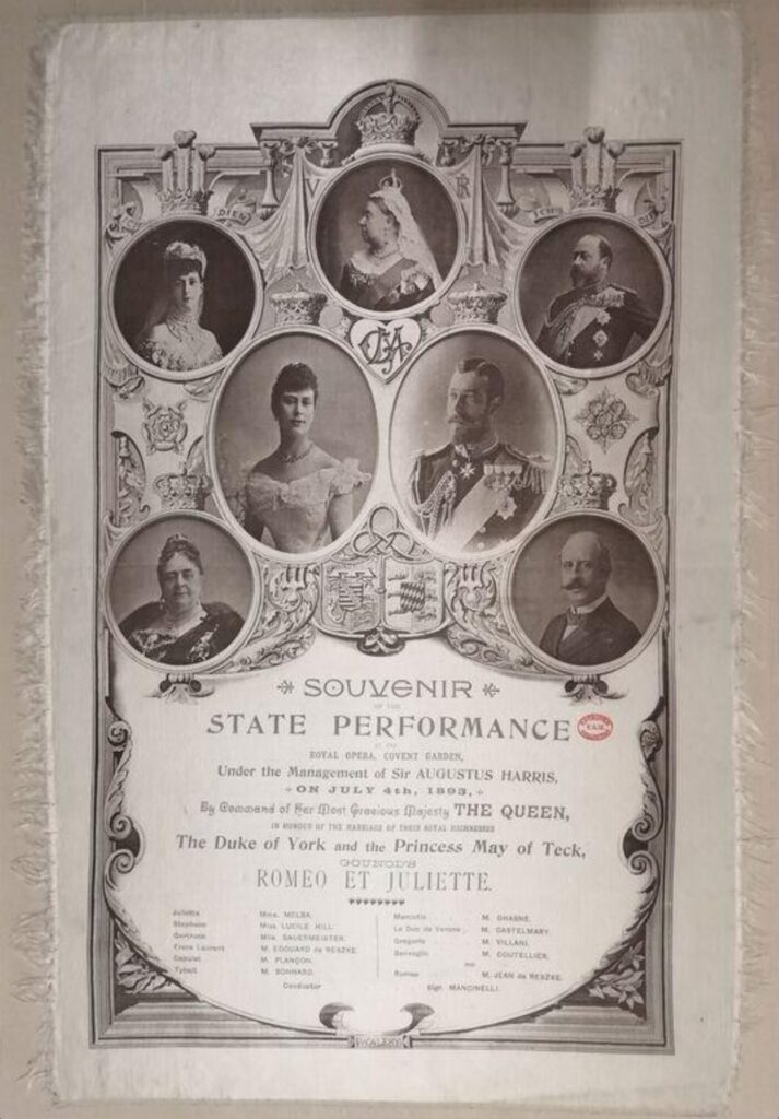
Among the many artifacts that shimmer within the folds of Victorian design history, few possess the tactile grace and ceremonial weight of the silk souvenir programme produced for the State Performance at the Royal Opera, Covent Garden, on the evening of June 30th, 1893. Commissioned to honour the royal marriage of Prince George, Duke of York, and Princess May of Teck, this programme is not merely a record of operatic entertainment—it is a masterwork of ornamental printing, photographic innovation, and typographic flourish.
Preserved today in the Victoria and Albert Museum’s Theatre and Performance Collection, the programme offers a rare glimpse into the intersection of art, technology, and monarchy at the height of the Victorian age. Printed on cream silk and adorned with sepia-toned portraits of Queen Victoria and other royal dignitaries, it exemplifies the refined aesthetic and technical sophistication that defined the period’s approach to visual communication.
An Exploration Through the 1893 Silk Programme
of the State Performance at Covent Garden
My dearest readers,
To print upon silk is to speak in whispers of reverence. In the nineteenth century, such a choice was never made lightly. Silk was reserved for occasions of the highest order—state performances, royal unions, coronations—moments when the printed word was not merely informative, but ceremonial. The delicacy of the fabric required a tempered hand and a refined adaptation of letterpress technique. One sees, in the 1893 programme for Romeo et Juliette, a meticulous restraint: the selvedge edges are clean, the fringing minimal, and the brown ink chosen not only for legibility but for its quiet harmony with the cream ground.
This was no ephemeral leaflet. It was a keepsake—an artifact of presence, of participation in a national tableau. The performance itself, featuring Dame Nellie Melba and Jean de Reszke, was attended by a royal party of forty. Covent Garden was transformed overnight: floral banks, electric illumination, silk drapery cascading from the boxes. The theatre became a stage not only for opera, but for spectacle, befitting the luxurious material of the programme itself.
Typography as Ornament and Order
Victorian typography was never shy. It performed, embellished, and instructed. In this programme, one finds a symphony of typographic gestures:
- The headings—Souvenir, State Performance—are rendered in elaborate serif typefaces, their terminals curled like wrought iron, their contrast echoing the architectural embellishments of the age.
- Hierarchy is observed with precision. The eye is guided from royal portrait to operatic detail with variations in size, weight, and spacing that create a rhythm both legible and ornamental.
- A mélange of styles—script, sans serif, decorative—reflects the Victorian delight in eclecticism. This was not confusion, but choreography. Each typographic choice served to elevate the programme’s ceremonial gravity.
Typography here is not passive. It asserts, it adorns, it honours the occasion and its audience.
Portraiture and the Walery Studio
The photographic portraits embedded within the programme are attributed to the Walery studio, one of the most esteemed portrait studios of the late Victorian era. Walery’s work is distinguished by its compositional grace and technical finesse, particularly in capturing the likenesses of royalty and theatrical luminaries.
The sepia-toned images of Queen Victoria, the Duke of York, and Princess May of Teck are not mere representations. They are icons, framed in oval roundels and heraldic flourishes that lend the programme a sense of dynastic continuity and reverence. The integration of photography into printed ephemera was a relatively novel innovation in the 1890s, and Walery’s contribution exemplifies the Victorian embrace of technological advancement in the service of aesthetic refinement.
Ornament as Narrative
Beyond its textual and photographic elements, the programme is rich in symbolic ornament. Floral motifs—roses, perhaps orange blossoms—suggest purity and celebration. Heraldic crests and symmetrical borders reinforce the hierarchical order of the monarchy. Queen Victoria presides at the top centre, flanked by her kin, in a layout that mirrors the social architecture of the event itself.
These embellishments are not idle decoration. They are narrative devices, embedding meaning into every corner of the composition and inviting the viewer to read not only the words, but the design.
A Keepsake of Enduring Significance
The 1893 silk programme is more than a souvenir. It is a cultural artifact—an object that encapsulates the values, aspirations, and aesthetic sensibilities of Victorian Britain. It reflects a society that revered monarchy, celebrated artistic excellence, and understood the power of design to elevate ceremony into memory.
To hold such an object—even in archival recollection—is to glimpse a world where beauty was inseparable from meaning, and where the printed page was not merely read, but revered.
Yours in observation and adornment,
Lady Westmacott
Leave a Reply